Building an App MVP to Help Users Tackle Social Anxiety, One Step at a Time
Shybye
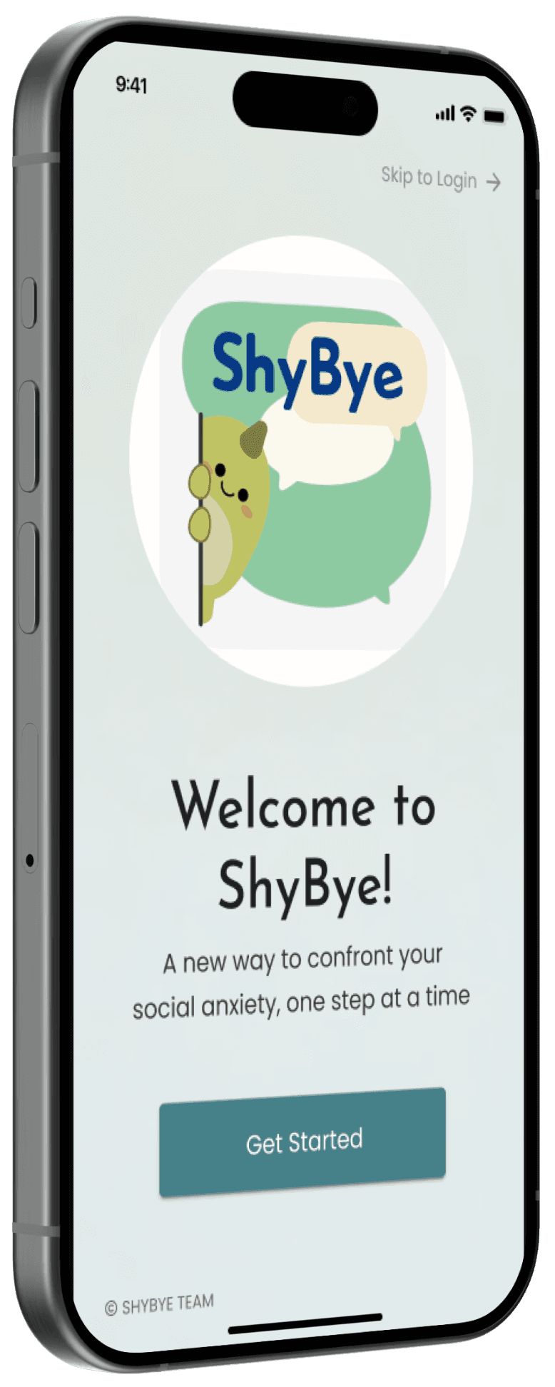
ShyBye helps users manage their social anxiety by providing challenges that encourage users to step out of their comfort zone. Users earn points and progress through levels. This positive reinforcement keeps users motivated and builds their confidence over time.
Team:
Collaborated with a volunteer team of 2-5 designers and 1-4 developers
Role:
UX/UI Designer
Timeframe:
2023
Contributions:
Challenge
People struggling with social anxiety need support to build their confidence and improve their skills in handling social situations, as even straightforward tasks can feel overwhelming and difficult.
Solution
We created an app with a series of achievable challenges designed to address common social anxiety triggers. The app provides positive reinforcement and additional resources to ensure users feel supported and motivated as they work on building their confidence in social situations.
Outcome
Satisfied users provided feedback that the app was "intuitive and supportive" and the overall app interest rating increased to:
4.8
Details
It all started at a hackathon
A couple of designers created the basic concept in just 3 days and it won an award. We started our plans with this basic V1 but it evolved a lot.
First, we put all our ideas on the table and got our priorities straight
We began with a big brainstorming meeting where shared ideas, discussed essential MVP features, discovered what we didn't know, and outlined our next steps. All this would evolve along with the project, but it was a starting point.
Our number one priority was to make each challenge effective but achievable for people with SA
Users reported that the most important coping tool is the ability to prepare for situations in advance. This highly influenced our model for ShyBye.
It’s about taking little steps to get out of your comfort zone which build up to bigger, more difficult tasks.
For each trigger or difficulty that users reported, we broke them down further into baby steps.
Resulting Challenge Idea: Make eye contact with someone in public.
Trigger
Starting a new conversation
Step 1
Approach a person
Step 2
Make eye contact
Step 3
Say “hello”
Step 4
Introduce yourself
Step 5
Make small talk
Step 6
Get to the topic of conversation
By breaking down the trigger, we made the task more manageable, boosting users' confidence for bigger challenges later.
We made simplification our guiding star
We were continuously iterating to reduce cognitive load and to make sure every feature had a distinct purpose. A few examples below.
Consolidating pages to streamline the flow
Through our research and usability testing, we found a few problems with our original design plans and made adjustments for a smoother more simplified experience.
Users struggled to find the info the profile page and didn't use it the way we intended. So, we updated it to focus solely on settings and account info to better meet their expectations.
We were surprised to learn that our users did not want the social community, they preferred privacy. This was a key feature for our MVP, but they were loud and clear, and we listened.
The calendar was not well-received and was too confusing, since it wasn’t essential, we decided to scrap it for MVP. However, it’s something to consider for future iterations.
We initially had a separate page for medals, but it lacked purpose. Now, they’re integrated into the Achievements page, which tracks all user accomplishments and progress over time.
With a simplified information architecture we streamlined the experience and better met the users’ expectations.
Giving every Achievement a distinct purpose
Many of our competitors had a similar problem- the overly complex gamification is confusing. Though it's a great tool for positive reinforcement, too many rewards makes it difficult to understand how to progress.
We avoided this by clearly refining the Achievements so that each one progresses the user and motivates them.
Levels help users see their progress over time.
Medals are provided for special milestones, inspiring users to do more
Streak motivates users to login daily
Challenges Completed helps to quantify the users accomplishments
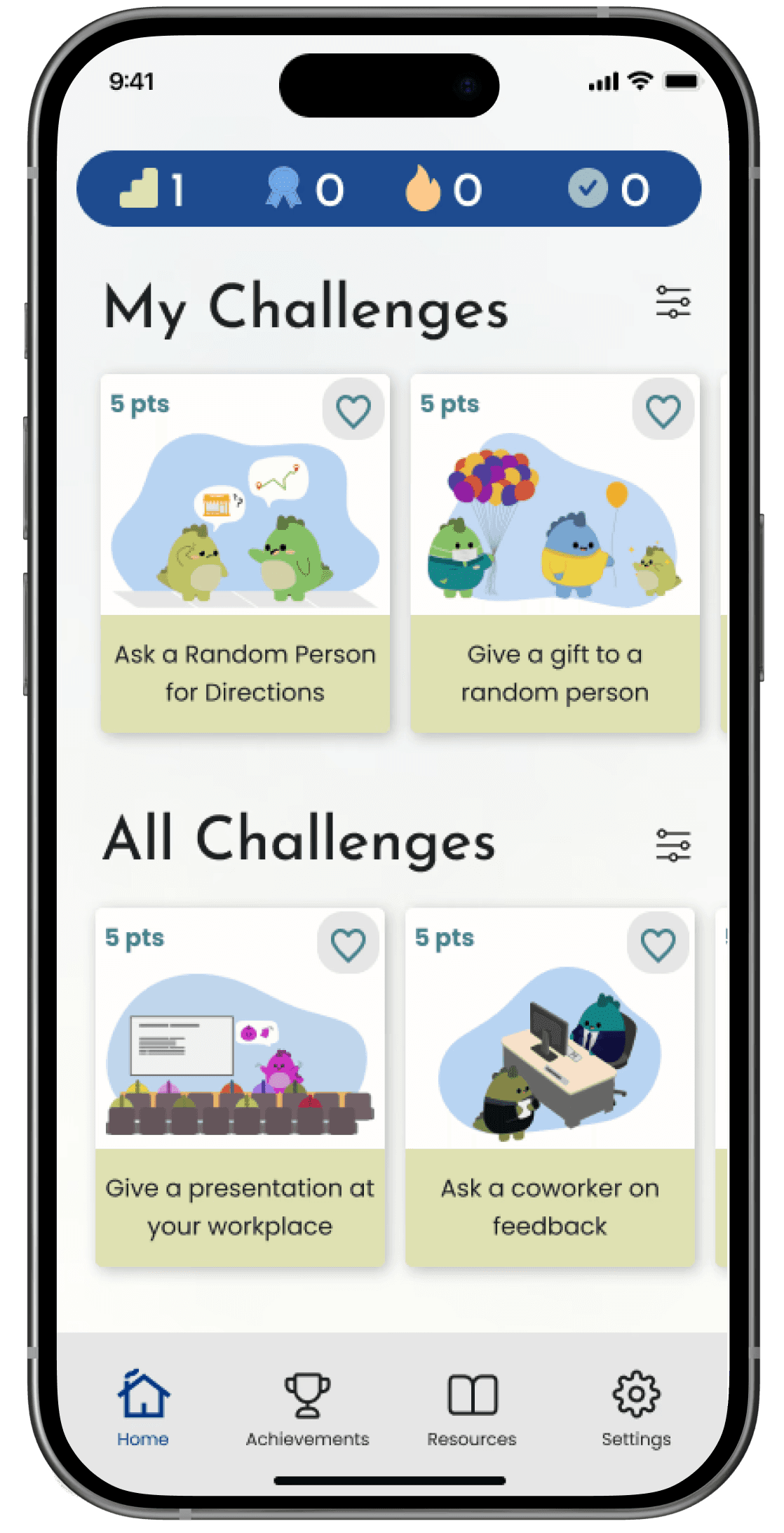
Keeping the users focused on the challenges by decluttering the home page
Initially we had a ton of ideas for the home dashboard and planned to include a lot more information on this page.
Our sketches included a plethora of info like a daily challenge, goals, points, saved challenges, on demand challenges, resources, a calendar.
Our sketches evolved into this design:
But, after usability testing we realized that the stats were taking up too much valuable screen space, making the users uncertain what to do first. So, we reduced the stats to a floating bar so that the priority is clearly the challenges.
You may have also noticed the icons changed!
Once the descriptions were removed the icons were too ambiguous. So, we updated and tested the new ones to ensure user comprehension.
We built user trust and ensured they felt supported
We aren't doctors or psychologists, so we leaned on scientific articles, medical sites (Mayo Clinic, National Institute of Mental Health, etc.), and real user data to ensure our information was reliable.
Unfortunately our original content was sending the wrong message
Walls of text and an impersonal tone made tasks feel daunting and cold- definitely not what we are going for.
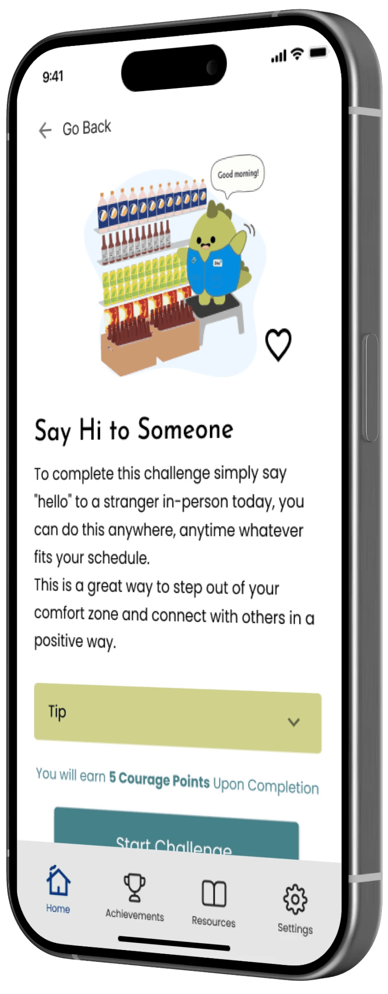
The Tip reminds users that they are empowered to do what feels best for them
Users loved the “Tip”, which is just an encouraging message tied to each challenge to make the baby steps even smaller and more achievable for users who may be struggling.
We were surprised how much users loved the Resources
This simple page with links to helpful articles, videos, and other apps was not a big priority for us, but it was easy to include in the MVP. Much to our surprise, users raved about it and felt it added to our credibility.
And not so surprising, everyone loved our cute Dino
The ShyBye dino is a cute little friend who is with users through their whole journey, it adds an element of fun and whimsey to the design. It’s intentionally integrated into almost every screen to serve as a constant reminder that users are not alone.
To make things challenging we had a big, last minute change of plans
We pivoted from a website to a native iOS app.
Initially, our developers wanted it to be a website. But, after more thought into how users would interact with ShyBye, the team made the decision to adapt it to a native mobile app instead, giving users the ability to better integrate ShyBye into their daily lives.
Another big change- our color scheme
Our original ShyBye colors had some contrast accessibility issues, and frankly they just didn’t compliment each other well. We also wanted our new colors to be more fun and align better with the dino graphics.
We played around with brighter more saturated colors, but we still want the app to feel calming and these are way too stimulating.
Results
4.8
/5
interest rating
By designing a simple yet fun interface, we created a tool that empowers users to navigate the challenges of social anxiety with confidence and support.
Multiple users descripted the app as “intuitive and supportive” and said that this is something they would like to use to manage their social anxiety.
With this win, we were ready for developer handoff and could start exploring enhancements beyond the MVP scope. ShyBye is still in the capable hands of our development team.


